Jodel
Repositioning the largest Portuguese detergent company by focusing on the revaluation of all its know-how and production capacity, preparing it for a greater bet on internationalization.
Organize by Function
Analyze the company's activity to identifying its distinctive competitive factors — productive capacity and market recognition. By doing this it was possible to validate a new structural organization that enhanced commercial effiency and the valuation of the business assets.
Rebranding
We valued Jodel's competitive factors by creating a clear and focused discourse highlighting it's unique ability to answer to the contemporary demands of the national and international markets.


Certifications
Integration of quality certifications in the identity, indicating the unequivocal industrial capacity for customers of any size.

Website
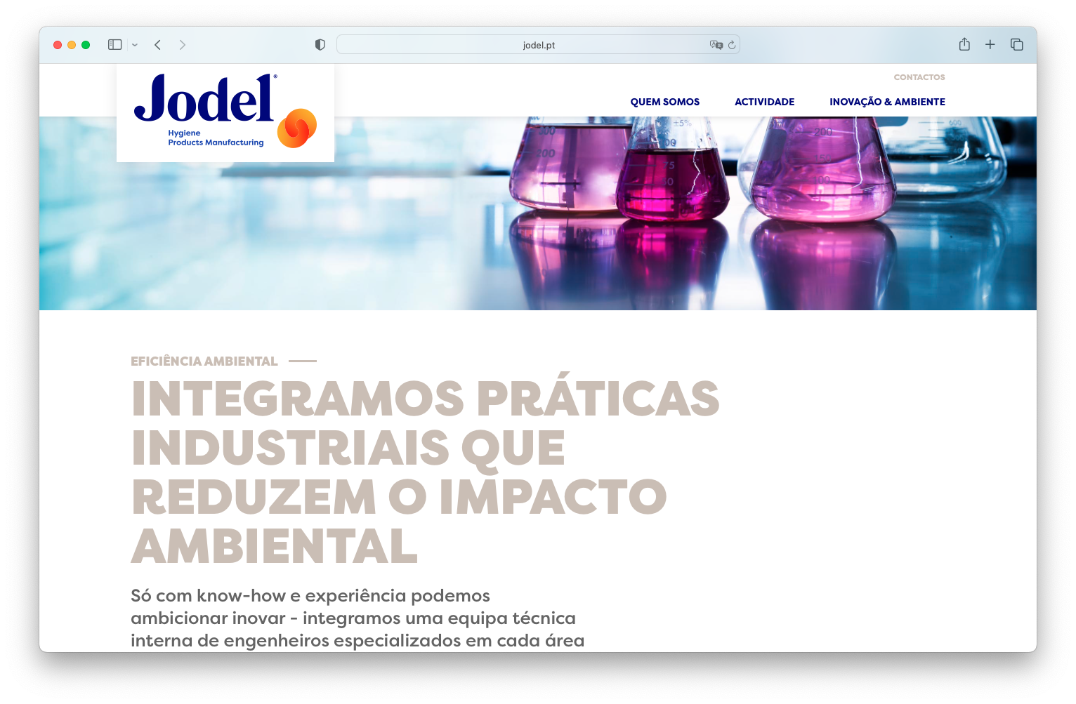
Built to be the company's main business tool, it follows UI/UX standards for optimal use on large and small screens.

